

Design Inspiration
Design a Successful Communication Strategy for Your Brand
A strong brand communication strategy is a long term investment.
So, how does psychology fit in with the way you design your business’ logo? For starters, what you need to have in mind is that everything that you add to its design, and can create some kind of meaning, is going to do precisely that. It will create meaning, it doesn’t matter if that was your intention in the first place.
The term “logo” comes from the Greek language. Its etymology stems from the word “logos” which means “word”. What does this mean for you? When you’re coming up with a logo for your business, you’re creating a “word” that’s visually engaging your audience.

It’s a simple fact that your customers are going to understand your logo the same way they understand words. Both are understood through their own perspective and interpretation. The root of all this stems from their own personal experience, as well as their cultural background. So, if various people are going to attribute different meanings to the same word, the same can be told for your logo.Because of that fact, you must put a lot of thought into every aspect of your logo. Think about how it can be interpreted. The more you do this, the more control you’ll have. You’ll better predict what people will think and feel when they see it.
So, one of the major things to spend your marketing budget on is thoughtful logo design.
A lot of people tend to follow trends and engage with anything that is “in” at a particular time. This is why it can be a great idea to come up with a trendy logo design that will appeal to your audience.
However, you must keep in mind the fact that while some trends live a long and healthy life, others lose their value fast. Trends can make people bored or even annoyed with them after a little while.
So do a little research on contemporary trends. What makes them so powerful? Can you predict whether they are going to stay fashionable for the years to come?
The thing is that when you design a logo, your audience is going to associate your business with it. Constantly changing it along the way is a difficult and expensive process. So you want to make sure that a logo redesign isn’t something that you do often.https://4937d27c595bdfa0850e2bcc4ac9f142.safeframe.googlesyndication.com/safeframe/1-0-38/html/container.html
You need to be aware of the fact that the human subconscious has various reactions to certain logo shapes. Every shape actually conveys a particular message.


When designing your logo, it’s essential that the final result is something that is simple to read. Don’t clutter it with too many details. This, however, doesn’t mean that you need to go all minimalist. According to logo design experts from Australia, the simplicity of how your logo is seen by your audience is a factor that gains their trust. Too many details tend to make the opposite effect and annoy people.
Of course, it goes without saying that your logo needs to be unique, in order for it to stand out among your competition. A lot of your success depends on this. Steer clear of stock visuals and images, and design something that will truly represent your brand’s essential values, while being simple enough to stick to everyone’s mind.
https://4937d27c595bdfa0850e2bcc4ac9f142.safeframe.googlesyndication.com/safeframe/1-0-38/html/container.htmlSource: https://www.pinterest.com/pin/251357222926766063/
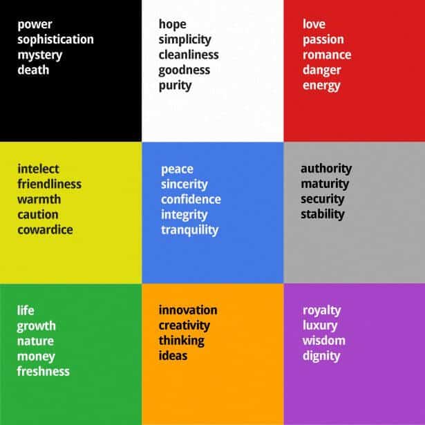
While it is a fact that color has a huge role in the psychology of designing your logo, it tends to be misconstrued by many people. When you search for “psychology of color” on Google, you will find many articles that will simply tell you which color represents what.
For example, you’ll quite often hear that the color red represents passion, energy, and love. But the fact is that there are a lot more meanings to it, same as every other color, and none of them are set in stone. Giving meaning to colors has been a long and continuous process, where people have given the same meaning to particular colors repeatedly, so it stuck. And still, different cultures and different people will attribute their own meaning to a particular color.
So, what to do? The solution is simple. Just pick a single color that you think is the best choice. Try to make sure that it fits most of the meanings that people attribute to it. That way you will be the one having some control over what they see in it, and in time, they will associate that particular color with your brand. You can’t control the way everyone will perceive your choice. But it’s certain that the color that you picked is going to stick with your brand image for good.
If you want your logo to have a meaningful effect on your audience, you must approach its design from a psychological perspective. Shape and color are some of the most important aspects of the psychology of logo design.This affects your audience’s subconscious, and therefore, their feelings about your brand. Sometimes it’s good to follow a trend, but you need to be certain that it’s not just a short-lived fad.
In the end, it goes without saying that originality is an important factor, as well as simplicity. You want your logo to be clear and instill trust, not a mess that will only confuse your clients.
A strong brand communication strategy is a long term investment.

Color is so much more than meets the eye. In fact, color is one of the most important aspects of your marketing.
Do you want to know about the psychology of logo design? You’re in the right place.
No account yet?
Create an Account
25 thoughts on “The Hidden Psychology of Logo Design”