
Design Inspiration
Design a Successful Communication Strategy for Your Brand
A strong brand communication strategy is a long term investment.
 By
Jay Benjamin
By
Jay Benjamin
Choosing the right colors for your brand can help you connect with your ideal customer, strengthen your brand message, and inspire your customers to take action. But choosing the wrong colors? Well, let’s just say an unappealing color palette is a fast track to your customers saying “yeah, no thanks” and taking their business to a company with a more aesthetically pleasing (and confidence inducing) brand image.
The color palette you choose says a lot about your brand, so you want to make sure you’re sending the right message. Let’s take an in-depth look at color: the psychology behind it (and how it influences your customers), the biggest color trends on the market today, and – most importantly – how to create a brand color palette that’s the right match for your business.
Before you choose the colors you want to represent your brand, it’s important to understand what those colors mean – or, in other words, the psychology of color.
Different colors say different things about you, your business, and how you want your audience to perceive you. For example, a red and orange color palette is going to send a totally different message than going with blue and green hues. If you don’t understand the message colors send, you risk sending the wrong message – and your branding falling flat as a result.
There are all sorts of reasons people interpret colors in a specific way. Some color perception is a result of evolutionary adaptations. Others have to do with cultural associations (for example, when a baby is born, we associate pink with a girl and blue with a boy). And still others have to do with personal perception (if I like the color green, I’m going to interpret green in a positive way). But when you understand the interpretations people associate with colors, regardless of the reason, you can use it to your advantage.
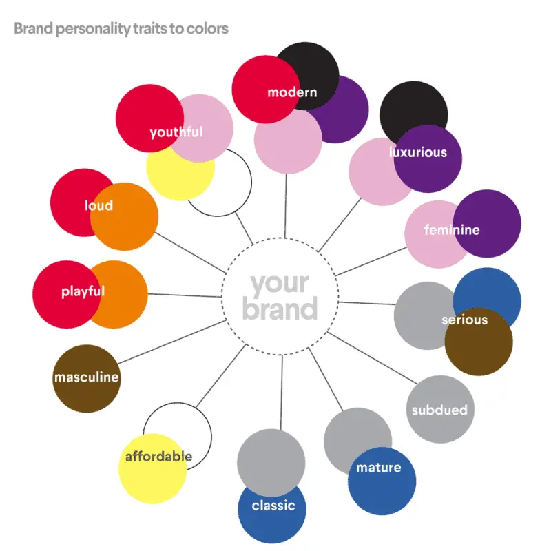
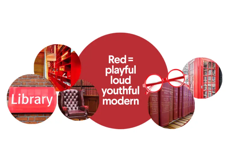
Understanding these common associations can help you choose colors that send the right message for your brand. Own a financial institution? Then you’d want people to view you as dependable, reliable, and trustworthy – making blue a great choice. Own a retail shop? It’s no coincidence that red is such a popular choice for retail brands (like Target and H&M); all that excitement and passion red ignites can get your customers in the buying mood. Want to appeal to the masses? Launching a children’s brand? Stick to youthful colors like orange, yellow, and pink to appeal to your bite-sized audience.
The more you know about the psychology behind color, the more you can use it to your advantage and pick the colors that will best support your brand and marketing. Once you’re done here, check out the Business of Color over at 99designs to learn more on color psychology for logos.
In addition to understanding the psychology behind color, in order to pick the best colors for your brand, you also need to understand what’s trending in the world of color.
While you don’t want to hop on board the bandwagon with every trend that passes by, keeping your finger on the pulse of what’s trending in color can help you make choices that feel modern, timely, and fresh.
So what, exactly, is on-trend in the world of color in 2018?
Pink is definitely having a moment in the world of color. Pink has been on the rise since 2016, when the Pantone institute chose Rose Quartz as one of two Pantone colors of the year. And since then, the trend has only continued to grow. While pink has traditionally been associated with more feminine characteristics, the explosion of “Millennial Pink” – a more mature blush tone – has helped pink evolve from a “girly” color choice to a full on new neutral with mass appeal that crosses both gender and generational lines.
If you want to feel fresh and modern and widen your appeal, try incorporating a salmon or blush-toned pink into your branding.
Speaking of Pantone, the world’s leading authority on color has finally named their 2018 color of the year: Ultra Violet. This deep purple shade, which according to Pantone “communicates originality, ingenuity, and visionary thinking,” is going to be everywhere in 2018.
This purple hue is all about edge. For brands wanting to appear trendy, cool, and hip, incorporating Ultra Violet can be a great way to connect with an edgier consumer.
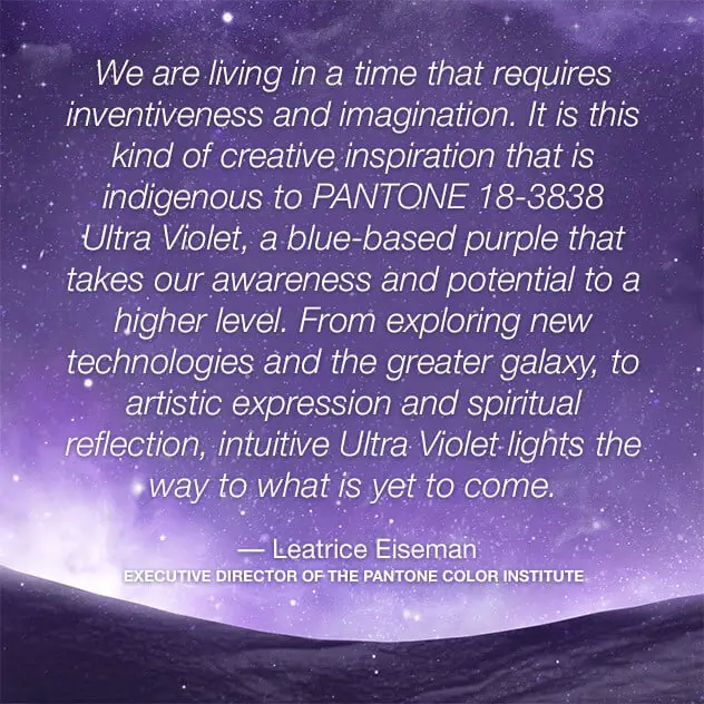
Scandinavian design is one of the hottest trends in the design world. And applying Scandinavian principles – which are all about packing a minimalist, no-frills punch – to your color choices will lend a sophisticated edge to your branding in the upcoming year.
To embrace this trend, look for muted, neutral tones inspired by nature (grays and blues are especially impactful).
Another major color trend in 2018 is all about throwbacks. 80’s and 90’s color palettes are all the rage in the world of design.
The 80’s/90’s trends is all about over-the-top pastels and electric hues (think neon!) that you might remember seeing splashed across PacMan machines and “Saved by the Bell” ads a few decades ago.
This is definitely a loud trend, so if the colors feel too overwhelming for you, try incorporating a touch of 80’s or 90’s hues as an accent.
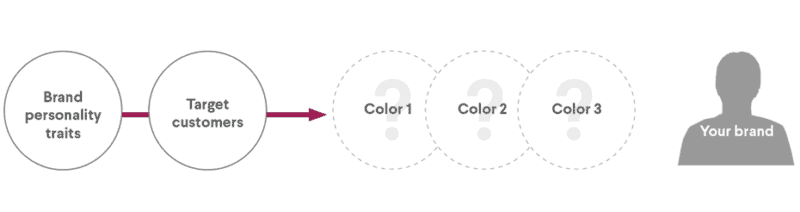
Now that you know the psychology behind colors and what color trends are having a moment, let’s talk about the process of actually choosing colors for your brand and logo design – which boils down to a simple formula: color palette = base + accent + neutral.
When building a brand color palette, you need three colors: a base color, an accent color, and a neutral. While you technically could get away with a bit more or less (most brands have anywhere from 1 to 4 colors in their palette), using the base-accent-neutral is a good place to start.
Your base color is going to be the most prominent in your palette, so you’ll want to choose the color you feel best represents your brand personality. For your accent color (which is the color you’ll use the most after your base), you’ll want to choose something that pairs well visually with your base color while still representing your overall brand personality (choosing analogous colors, which are colors that are next to each other on the color wheel, or complementary colors, which are colors directly across from each other on the color wheel, are great choices). And for your neutral, choose a color that will work well as a background player, light a muted gray or beige.
Now, remember – your brand color palette is one of (if not the) most important part of your branding, so when it comes to choosing colors, choose wisely.
Understanding color – the psychology, the trends, and the best applications in your branding – is one of the keys to successful marketing. And now that you know the 411 on all things color, you can use it to your advantage to build an effective, successful, and – yes – colorful brand.
A strong brand communication strategy is a long term investment.

Color is so much more than meets the eye. In fact, color is one of the most important aspects of your marketing.
Do you want to know about the psychology of logo design? You’re in the right place.
No account yet?
Create an Account
23 thoughts on “Psychology of Color in Design: How to Choose the Best Colors for Your Brand”